Step-by-Step Fan Site Design
This post has been brewing and preparing for a long time. Originally, it was supposed to come out as a continuation of the article series "Creating a Fan Site" (one and two). So, what is this article doing in the Fable 3 blog? The answer is simple: when it comes to design, without a very specific example, it’s hard to explain anything. There is no spherical design in a vacuum. Therefore, when it was decided some time ago to reboot one of our fan sites dedicated to the Fable game series, I thought this was the perfect example to use for "sharing my wisdom."
In fact, I certainly did not set out to reveal the great mystery of the universe or to teach you how to create a unique design for your fan site with just one article. The topic of design is huge and multifaceted, for one designer to fully explore it using just one piece of work... I also want to clarify that this is not a Photoshop tutorial. There are plenty of those without me, Google is your friend. As an author, I assume you are already familiar with the basics of Photoshop functionality, so don’t expect step-by-step instructions like "click here" or "go there." This is not a Photoshop lesson; it's a master class on design creation. I will share how I work, suggest some tricks and secrets that are not really secrets but are often forgotten. Let’s get started :)
Preparing the Easel and Canvas
In our case, the easel is going to be, as you may have guessed, Photoshop CS4, and the canvas is our initial, still empty new file. Besides "photo manipulation," there are also other programs, like Gimp. Some manage to work in Corel Draw. But anyway, humanity has yet to invent a better web design program than Photoshop. This is the main tool for a web designer. Corel Draw or Adobe Illustrator can be used to create individual elements of your design, but it is most convenient to "assemble" a layout in Photoshop.
We’ve dealt with the "easel," now it's time for the canvas. Here it's worth remembering screen resolutions. Five years ago, a resolution of 1024x768 was everywhere, while 1280x960 was just starting to capture people's minds. A couple of years ago, 1680x1050 and 1600x1200 were considered high resolutions. Today, monitors with default Full HD resolutions are becoming more and more the norm, so we should aim for a maximum resolution of 1920x1080. However, 1024x768 is still not rushing into retirement, so that is our minimum standard. In fact, the width is more critical because our site will be long, as are 90% of all sites on the net.
In the past, it was trendy to create "stretchable" sites, meaning individual design elements were made from repeating patterns, allowing the site to stretch to the user's resolution. But with the arrival of Full HD, this method of adapting the site to the user's resolution has become unsightly. The human eye perceives information at an arm's length well with a width roughly equal to an A4 sheet. Anything wider is no longer in focus. So, lately, it has become common to make the content area narrow, with the remaining space on the left and right filled with some background decor. This way, both the sheep are fed and the wolves are safe :) Thus, our content area will equal 1000 pixels (don’t forget that in the browser, the scroll bar on the right "consumes" those very 24 pixels out of 1024). Accordingly, our area for the "margins" with beautiful backgrounds will be (1920-1000)/2=460 pixels on the left and right. To avoid accidentally going beyond this area, I use guides. With the rulers enabled, I simply drag the cursor and "pull" the guides to the necessary places. I can also mark the center of our canvas right away. I have also roughly marked the height where I will allocate for the site header; it will move in the future, but I made a "notch" for myself. That's it; the preliminary work is done. Let’s move on to the preparatory stage :)
Preliminary preparation is complete
Drawing Inspiration
This stage is both the simplest and the most complex at the same time. You need to gather the materials from which we will sculpt our design. If you are a professional artist, you can of course draw all the necessary art and interface elements yourself or delegate it to your team... On the other hand, in that case, what are you, Artemy Tatonovich Andreyevich, doing in this article? :) This article is for beginners. We will need thematic art and elements for our interface, or at least the materials from which we can create these elements. Chances are that you won’t collect everything you need for your work on the first try, so you'll have to return to searching for art and inspiration several times. I usually start my search from the official site, then move to large fan sites if they exist. After that, I switch to searching for images on Google and Yandex. It's worth using both search engines since the results can differ significantly. Where one fails, the other can find tons of material. It's good if there's plenty of art available, or if there are large screenshots of the game's interface; the developer releases many wallpapers... but more often than not, you will find yourself lacking something.
As a result of my searches, I found quite a few pieces of art related to Fable and not just those, from various parts of the game. But for the third part, beautiful art is scarce. However, gather everything: wallpapers, concepts, screenshots... You never know what will come in handy. I won’t bore you with the full compilation of the found material. In the spoiler, you'll find the elements that eventually formed the basis of the design.
This frame was eventually broken down into a whole bunch of individual interface elements
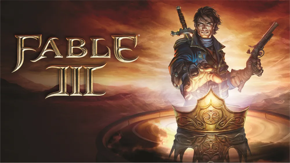
The first decent art found for the third part
And this is the second art piece. That’s it, nothing else in the needed style was found
This art was immediately taken for the background. It's not perfect, but better wasn’t found.
Art for the second part was useful at the very end of the work
Where would we be without a logo?
Starting Work
Now we can get down to work. I'll share a little trick right away: I regularly save my work under a new name to keep a version history. By default, the first result is version 0_1, then comes 0_2, 0_3, etc. Version 1_0 occurs when you feel you've done everything you wanted and can start showing the work to reviewers/friends/clients. Most likely, the design will require revisions. Then versions 1_1, 1_2, and so on will appear. This is convenient for tracking your own progress and also to have the ability to return to ideas from older versions or pull some element from there that you deleted or changed beyond recognition in the current version.
One more piece of advice: in Photoshop, all your elements are stored on separate layers. Don’t be lazy; give them meaningful names right away, and group layers of a particular element using the ctrl+b function. When your file collects over 100 layers, it becomes extremely difficult to sort through them without labels and grouping.
But enough talking; let’s take a look at the first result. Although this isn’t even the first; this is almost a zero:
At this stage, the content area is roughly outlined, and the arts are placed more or less where they might go. Everywhere, you see both visible and hidden elements, which will later need to fit into the design. Or not fit. Moving forward. By the way, at this stage, two important technical works were carried out. Our character was carefully cut out from the background, and the frame was disassembled into small parts.
For cutting out, I often use layer masks rather than an eraser. Areas that need to be hidden are painted black, and visible parts are left white. Shades of gray represent transparency. Thanks to this, if I erase something unnecessary, it will be easy to return it to its place. I saved the cut-out character in maximum resolution separately, so it wouldn’t get lost.
The frame was disassembled into pieces by cutting small chunks and turning them into textures. The corners are reflections of the upper-left corner thrice repeated. This way, I achieved symmetry.
Initially, the design was planned to be somewhat dark, styled similarly to our first two main arts. Using soft brushes and various blending modes, I managed to turn the quite bright background image into a rather dark canvas. I tried to depict the content area as a folded parchment that should be framed by the familiar golden frame. The crown, one of the key elements, continued to be present in the design. I started to slowly look for a font for the menu.
There is a slight tension with beautiful Cyrillic fonts. Because, as a rule, they are simply not available. In other words, there are English letters, but no Russian ones. Either the Russian version costs a pretty penny, or the Russian version is made poorly and clumsily by folk craftsmen. Or everything is good, but the font is illegible :) The font in the picture is called bonzai. If anyone needs it, feel free to ask. Let's move on.
After some struggles, something meaningful began to take shape little by little. The first version of the main menu was made (it will change later, but the base will come in handy more than once). Attentive readers may notice that the left and right parts of this menu are our crown combined with a swirl from the frame. Don't be afraid to combine different interface elements. Together, they often give unexpected yet pleasant results. Additionally, the concept of the main content area changed. I tried to present something like a royal mantle, but I was completely unhappy with the result. Thus, I made a decisive decision to change the concept.
This isn’t a new iteration yet; it’s basically just a trial of ink: how will it look in a light version and without the "mantle"? - Clearly better, but more thought is needed. By the way, the elements on the top left are "letters" from the fleur font. An excellent option for creating interface elements. A whole bunch of swirls and flowers in one bottle.
And here’s something new. I experimented with the placement of our hero in the site header, but the main thing is not this. I gave up the horizontal menu and tried to create a vertical one. Why not, it actually looks pretty good. And our central menu has shifted to the footer.
Another intermediate iteration where I compared the horizontal menu and vertical one while considering making the side blocks expandable by click.
Here’s the case where saved previous versions come in handy. The design went completely awry. The scroll stretched across the entire content width with the frame in the middle and the reduced frames for the side blocks looks awful. I abandoned this version, took a step back, and moved in a different direction.
And here is the moment of truth! Having stepped back, tinkered with our elements, in the end, I got a layout that is very close to the final one. All main elements are assembled and in their places: the main menu, side blocks, content, header, and footer. If you look closely, you can notice that some elements from the previous failed iteration were helpful. The text markup was taken from a random site about Dragon Age, just to estimate the text placement. The primary font used is Palatino Linotype. This is a beautiful standard font, which is very important. In this case, your site will be displayed without issues to all Windows users for sure. There is a way, of course, to use custom fonts that the site will load into the user's cache, but that means extra traffic and font display issues in different browsers. I don’t recommend getting too carried away with this. There's a great table of standard Windows fonts on the internet. I use it myself, and I recommend it to you. However, in the header, it's okay to and even beneficial to use decorative fonts. At this stage, I found a fantastic font for the site’s name called Algerius Caps. Feel the difference from what it was!
A very interesting stage that visually demonstrates that even in a design close to completion, there is always something that can be improved. First, I finally abandoned the bottom menu and turned it into a footer. Remember when I said that the horizontal menu would be useful? - It came in handy. The layout was cleaned of any unnecessary elements so that they wouldn’t clutter the design. But the most important thing is that a final place was found for the crown in the design. Off with the sword from the sheath! We take one of our arts and cut out the hand with a sword and crown from it. The work of painting the logo, which hung over the glove, was simply exquisite. This is one of those cases where a scale greater than 1000% can be very helpful. Also, I began working on color correction for our background. It was too yellow-green. I muted it. To do this, I usually use an additional layer filled with the desired color set to soft light blending mode, but as needed, you can try other blending modes. In this case, the gamma was adjusted using a blue layer.
I continued polishing the design. I corrected the placement of the art in the background and again adjusted its color scheme. I removed almost all the remaining clutter from the previous cleanup, except for one swirl that I missed. Additionally, I noticed that the site name looked bland against the sky background. So I fixed the style and made it contrast with the background while still using the site’s main colors.
Final Stretch
Daaaam! Here it is, version 1_0. In fact, this is not the final one, but at this stage, I decided to show the layout to my friends and listen to their feedback. There’s no clutter here anymore, and the background has been recolored once again. But more importantly, a menu with a search bar and social media buttons has been added. Initially, only RSS will work, but soon a Twitter account, YouTube channel, and Facebook page will be opened.
The first important note: our hero looks quite lonely in the website header. He needs company. Unfortunately, no beautiful female art for the third part was found, but a gypsy from art for the second part came to the rescue. And it’s fitting. The site isn’t just about the third part. As a trade-off for the girl, our hero had to be stripped of his pistol, which became clearly unnecessary.
But that’s not all: another batch of comments came in. The site turned out to be way too gaudy gold, and the golden frame of the central content block took up too much space. Well, I muted the shade using layer effects and reduced the frame size. The chains that weighed down the design and complicated the layout were also removed. The moment of truth has arrived. The final version:
www.Fable-game.ru
Epilogue
In fact, we still had the layout process ahead of us, which also brought about some small adjustments. For instance, the background and the hero's placement relative to it. There were also style corrections, bug hunts, and mishaps. But that’s all just technical details. The most challenging part is behind. Once you’ve reached this stage, you can relax, pat yourself on the back, and confidently add your new work to your portfolio. Afterwards, you can focus on filling the site with content, optimizing its structure... but that’s a whole other story :)
I sincerely hope that my "story with pictures and about pictures" has pleased you, and most importantly, that it will help you create your own beautiful, unique, amazing designs for your sites. I look forward to your questions, suggestions, or comments in the replies.
*The author of the design and text is me, Ksandr\_Warfire
The material is prepared specifically for GAMER.ru