Fan Art: Drawing Jack [Jack]
Actually, let me warn you right away: this guide does not claim to be anything special. I just wanted to share some moments of drawing fan art with you.
WHERE TO START
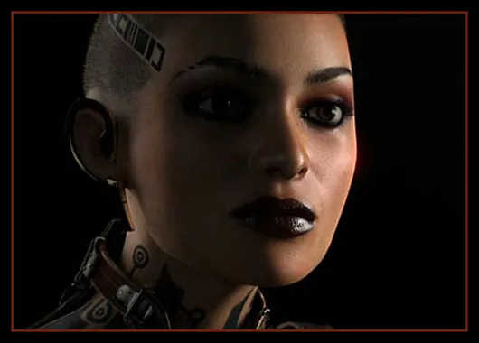
We're going to draw this little pest...
It was evening, people weren’t coming, the runes were stuck, and I was absolutely unable to get anything done with the posts. The best remedy in such cases is to change your activity. My friend has long been pestering me to take up a pencil and finish her portrait. Deciding to warm up a bit before starting that portrait, I pulled out my materials to refresh my skills. Since I've been following this blog for about a month, I wanted to diversify it somehow, so I quickly settled on the theme of fan art. I also decided on who to draw right away: of course, the vibrant and very colorful Jack. Done and dusted, and I grabbed some paper.
A couple of words about materials. I prefer A3 watercolor paper. It’s thick and pleasantly textured, allowing you to draw anything. The A3 format is great for all sorts of details: it allows for a large and expressive output. A little about pencils: if you are seriously into hand-drawn art, I advise stocking up on a full set of pencils in various hardness levels. Hard ones (marked H) are good for clear lines and don’t smudge. Soft ones (marked B) blend well but can make a mess. Personally, I prefer soft pencils precisely because of their blending ability. If you like making transitions with strokes instead of blending (which, by the way, is actually correct), then very soft pencils won’t work for you; it’s better to use medium ones for better stroke application.
A few more important points. Pencils need to be sharpened very sharply, but a regular sharpener won’t give you the needed “angle,” so your wooden friends should be sharpened with a knife. The sharper the pencil, the better and cleaner your work will be. I also recommend making yourself proper erasers. A regular eraser is quite dull, and you won’t be able to erase small details with it. So, we take it and cut it diagonally, and we’ll get an eraser with good sharp corners, which can gently erase the tiniest element without affecting the adjacent areas of the drawing. You’ll also need a tablet, a piece of wood, an old album, or plywood. In general, anything that you can rest your drawing on. If you draw the old-fashioned way on a table, you will see the paper distorted (due to perspective), and your drawing will “shift.” It’s important for your line of sight to hit the paper perpendicularly; then there won’t be any perspective distortions, and your drawing will become more accurate.
I also advise keeping a camera nearby and periodically snapping a shot of your drawing. Viewing it from the monitor reveals all the flaws and rough edges, especially if you flip the drawing from left to right or vice versa. This is necessary to catch mistakes in your work in time and fix them promptly. As far as the basics go, that’s about it. I suggest you scroll further and take a look at what else is there. I don’t claim to be a painter, and the advice in this guide is quite general. Nevertheless, you'll be able to form your impression of how to draw your piece.
SKETCHES AND DARK SPOTS
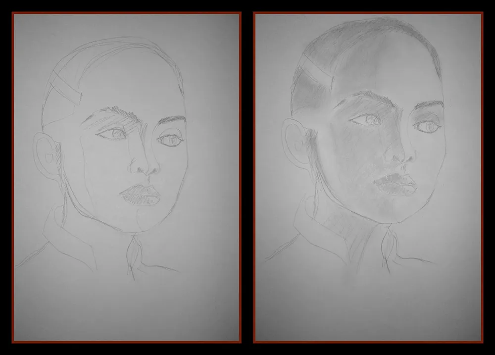
The first two stages - sketch and shadow outlines.
Any drawing begins with a sketch. You should spend the most time on it because if you have problems at this stage, it leads to long, tedious, and painstaking corrections later on. This isn’t Photoshop; you can only roll back using an eraser. And a soft pencil, for example, erases worse, mainly smudging, unless you have a special eraser. In general, do you need that? So, we sketch it out, be sure to take a photo, and check if everything is to your liking. Everyone draws sketches differently. Some with construction (which is the right way), while others freehand (I, unfortunately, belong to this category, but you shouldn't take me as a model). Construction is always better because you clearly see proportions. Moreover, construction is better for analyzing the shape of the object.
I draw directly, without construction. I outline the contours of the face, estimating the placement of the eyes, lips, nose, and so forth. As mentioned before, I spend the most time at this stage. I constantly make corrections based on how the sketch appears on the monitor, reflect the image, and see where something has shifted. It's better to do the sketch with a hard pencil: it’s easier to erase and doesn’t smudge, especially since you won’t be blending it anyway. When I see that the sketch generally suits me, I start working more closely with the shadows.
At this stage, it’s important to identify the more darker areas and the more lighter areas: these will “shape” your face. Get into the habit of making the face with shades rather than lines; it looks prettier and more realistic. At this stage, don’t press too hard on the pencil; you’ll have time to deepen your shadows later. It’s important to distribute the dark and light spots accurately and then work with them. Notice how shadows lay depending on the light source. In this case, it’s clearly behind, and the darkest area will be the center of the face (the farthest from the light source).
BLACK EYES... AND SO ON

Eyes, lips, and nose – the most important elements of your portrait.
Once I've tackled the light and shadow, I begin the drawing of the face. The tastiest part, of course, is the eyes. When drawing eyes, keep two things in mind. First, the eye is round. So, this roundness must be conveyed with shadows on the eyeball and eyelids. Second, and often overlooked: dear friends, the eyes are wet, and they shine. Without highlights, they will appear lifeless and expressionless. By the way, if you can’t figure out the color of the eyes, you should rely on the tone of the pupil: this is the darkest part of the eye. Everything else is lighter. Don’t believe me? Look in the mirror at your own eyes. The darkest and most saturated part will indeed be the pupil, not the iris, even if your character’s eyes are black.
At this stage, we also consider the shape of the nose. If the eye is a sphere, then the nose is a prism. Remember this when drawing its shape. Also, don’t forget about highlights; on the tip of the nose and the wings, they will create the necessary volume. Please don’t draw the nose with outlines; draw it with shadows. Trust me, I’ve seen many different noses. Here, we sketch the lips. Considering the lighting, the lower lip will be darker, but it will also have more highlights.
Besides the eyes and noses, don’t forget about shadows: gradually deepen and blend them. Try to avoid sharp transitions; work with a soft pencil; it's easier to smudge. If you prefer hatching, use a sharp medium pencil; that way, you’ll achieve good fine strokes. At this stage, the face is already beginning to take shape. Constantly pull back from the picture, look at it from a distance or in the light; this will make it easier to spot errors. Or consult with those at home; mine are already knowledgeable and give me decent advice.
LOOKING FOR MISTAKES AND CONTINUING TO DRAW
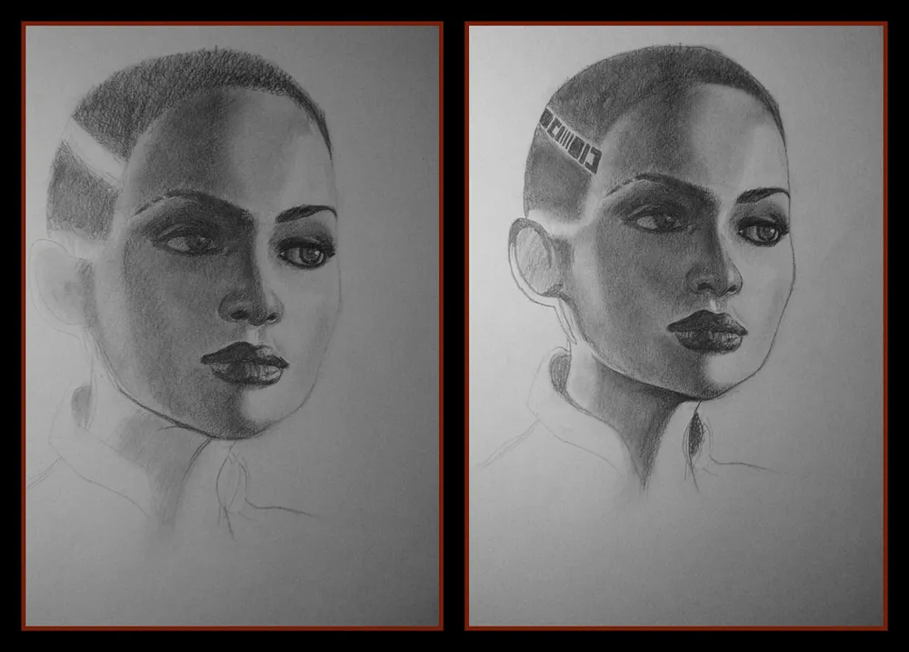
Facial feature mistakes are better caught by someone else's eye or a camera.
Why do I keep talking about digitizing the work and studying the drawing from the monitor? Because the eye gets used to it, and the facial features may “swim.” I can see that my lips look different and my nose isn't quite right compared to Jack's. And the eyebrows could use a bit of tweaking—make them a little wider and darker. That’s exactly what I’m occupied with at this stage, continuing to work on the face.
By this point, I have already sketched the contours of the face, figuring out the light and shadow on the chin and shadows on the neck. Working with the neck is interesting, especially due to the aforementioned light sources. The dark areas are very clearly defined.
At this stage, I also start drawing Jack’s tattoos. Tip: if you're right-handed, I recommend drawing from left to right and top to bottom. Why? It's simple: you won’t be dragging your hand across already drawn fragments. Ideally, you should “set” your hand and support the drawing not with your whole palm but just your pinky. If you’re struggling with your hand placement, put a clean sheet of paper under your palm to avoid smudging your drawing. Just make sure not to slide that paper around; the pencil smudges easily when rubbing paper against paper.
I sketch the contours of the tattoos and hatch them. Then I blend the pencil in the area of the character’s “hairstyle” and outline the contours of the face. This will be required for further manipulations with the drawing, but generally, as I mentioned before, outlines should be avoided. This is because I plan to make the background simple and black, but hatching with a pencil would be a hassle; it’s better to use charcoal. And since I have no charcoal, I will have to rely on Photoshop. That’s what the contour is for. However, if you were drawing the background in charcoal, the outline of the face wouldn’t have gotten in your way.
DETAILS

In the final stage, don’t skimp on details.
I digitize the picture again and examine what I like and dislike. I slightly adjust the oval of the face and the corners of the lips, and then proceed to the details I have left to draw. These are clothes and tattoos of Jack on her neck, as well as the spikes of hair. I change the hairline a bit, remembering to place a sheet of paper underneath to avoid ruining the work, and then I move on to the clothing and tattoos.
By this point, most of the work is already done, and drawing the clothing is indeed easier than creating the face with light and shadow. Remember that tattoos are among the darkest elements of the picture, and don’t forget that the skin of the neck should also have light and shadow. I blend the shadows on the clothing, darken the eyes a bit more, and go over the entire picture again, adding shadows and strokes. If you wish, you can cover the drawing with a special fixative that prevents the pencil from smudging. Or just store the drawings in a separate folder in files.
In the final stage, adjustment begins. Scanners typically overexpose your image, while cameras tend to darken it. Or they flash, which isn’t good either (especially considering that graphite reflects light beautifully). And we need to convey to the viewer what it really looks like, your creation. Therefore, first, we scan your work (the drawing will be clearer than if photographed), and then in Photoshop or another graphic editor, we “adjust” the light, shadow, contrast, and so on so that the image on the monitor closely resembles how it looks in reality.
My scanner is temporarily “sick,” so I had to photograph the work, losing some details and the sense of “graininess” in the drawing. As I mentioned, I have no charcoal, so I picked a sufficiently dark gray shade and used the tablet to finish the background. I also recommend adding a frame for added beauty and completeness to the work. If you have a signature, add that too. The country must know its heroes. That’s about it.
INSTEAD OF A SUMMARY
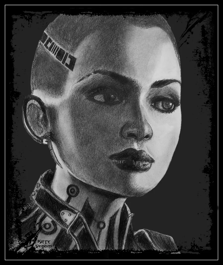
Here’s how the final work looks after all the finishing touches. Not perfect, but it’s mine.. ^^
So that's how it goes. We created a sizable piece, the blog received an unusual post, and I cleared my head. Drawing really helps with that, by the way. I hope you learned something useful, and this guide didn’t seem too tedious. For those who want to draw by hand, I can recommend the books by Nikolai Lee; as far as I know, two have been published. One is about human head anatomy, and the other is an overview of drawing techniques. In my opinion, nothing has come along that’s better than those “textbooks.” I also advise joining the Demiart forum; it’s the best resource on the Russian Internet for everything concerning graphics.
Thank you for your attention. I would appreciate criticism and comments. :)
P.S. I apologize for the quality of the stages; my camera isn’t great. Regarding the final work: despite all the tweaks, it looks much better in reality. That’s the ungratefulness of the pencil for the internet: you can never really show how it looks in person...