August 2010 Calendar with a Guide to Creating
This post should have appeared a couple of days earlier if it weren't for a malicious bug aka bug, sneaking into the depths of GAMER.ru and damaging the image upload module. Or at least a few hours earlier today if it weren't for random clicks on the GAMER.ru background, which these days lead to fogame, destroying all efforts to create this post completely. And so twice... But let's not dwell on the sad. Finally, everything is okay, and I'm ready to show you and talk about the new calendar for August 2010 in the style of The Witcher 2!
1920x1080
1680x1050

1440x900
1600x1200

1280x1024

1280x960
1024x768

Work in progress...
When starting the work on any wallpaper or calendar, which is essentially just a type of wallpaper, you should always remember that as many people as there are, there are that many monitor resolutions. More precisely, there are primarily seven: 1920x1080, 1680x1050, 1440x900, 1600x1200, 1280x1024, 1280x960, 1024x768. There are other resolutions, but these are the most common. And it is considered good form to create versions for all these resolutions. This means that initially, you should create the wallpaper with consideration for the maximum width and maximum height. I forgot about the second half of this rule at the beginning of the work :) That is, the maximum height was initially 1080 instead of 1200, which means I had to come up with ways to adjust for the 1600x1200 and 1280x1024 formats as best as possible. As a result, the versions of the calendar for different resolutions differ a bit more than usual.
If you remember my **post about creating a fan site design**, we went through the canvas preparation stage together. Essentially, the algorithm for both fan site design and wallpaper is roughly the same, just with all its nuances.

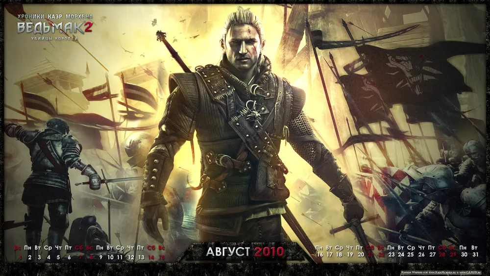
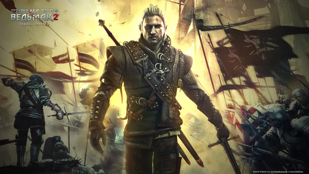
The source, where it all started
Let's get to work
The next stage, as always, was choosing a base for my calendar. I really like the last published poster. However, its main drawback is its proportions. It has a super-cool bottom with soldiers charging into battle, but if you cut the poster in half, we will have a rather ugly severed head and legs of Geralt in the center. It would be logical to cut the bottom part and work with the upper part. But just Geralt's torso against a yellow sky with crows is not interesting enough. Let's leave such decisions to novice photoshop users. So I set the following tasks for myself:
a) Keep the soldiers in the background
b) Place Geralt in the center in full height
c) Remove the ugly severed head from the frame
d) ???????
e) Profit! :)
The problem was that I had "almost" no sources for this poster. I mean, I had a version where I could remove the logo and copyrights, but the image itself was monolithic. CDProjekt RED pretended that they had no sources, claiming they hadn't saved them, saying the poster already had a finished view. Well, I had no choice but to act like I believed them ;)
In the end, I made several copies of this poster in Photoshop and started moving them in relation to each other, forming the overall concept. At the same time, I adjusted the sizes of the layers in relation to each other because I needed Geralt to be smaller than in the original, while the soldiers were almost the same size.
The problem was also that in the left part of the poster, where the soldiers are running towards the enemy, there is also Geralt's sword protruding. I needed to mask that too.
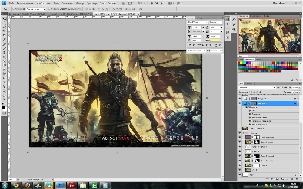
This is what the source looked like at the end of the work. In the lower right corner, you can see those very mask layers
My advice to novice designers is - don't use the eraser. Once you delete a piece of the layer, you might later realize that you removed too much. Therefore, I use so-called layer masks. To attach them to a layer, simply select the layer and click on the corresponding icon in the layers list window. Layer masks are super useful. They define which parts of your layer will be visible and which will be transparent. Black areas are transparent, white areas are visible, and gray tones are semi-transparent. By using soft brushes, you can very carefully hide unnecessary parts of the layers, but if you hide too much, you can simply take a white brush and paint the black area white again. Voila! The "removed" part of the layer returned to its place. Save the eraser for those cases when you're completely sure you won't need part of the layer anymore.
When I finished manipulating the arrangement of layers, and everything seemed quite organic, I noticed two flaws in my work.
The flags on the right turned into a large dark blot that drew too much attention.
Geralt did not stand out well enough against the background.
The solution for the flags came naturally. I have a vector version of The Witcher 2 logo in my stash. You have already seen it in the project for future t-shirts. Soldiers running under the witcher's banner? - Why not. "Quite cool and symbolic" - I thought. Since Geralt got himself neck-deep in political intrigues, anything can happen. Witchers fought at Sodden Hill, so why couldn't soldiers go into battle under the witcher's banner? Said and done. After some simple deforming manipulations using the main pointer and the deformation frame in different modes, the banner began to be adorned by the snarling wolf. The overlay effect was wonderfully achieved using the "Overlay" blending mode.
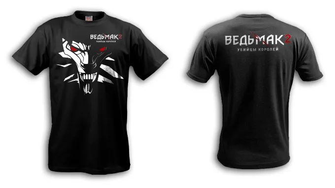
Do you recognize the face?
To solve the second problem, I created a pink layer on top with the blending mode set to "Soft light"; the image became more reddish and sinister. Then I applied a layer mask to the layer that I was already familiar with. In its center was a black-and-white gradient, which I then squeezed from the top and stretched from the bottom. As a result, I achieved the effect of a beam of light illuminating Geralt from above. Now he stood out more. To enhance the effect, I copied all the layers again and then merged them. A Filter Rendering -> Lighting effects was applied to the resulting image, which darkened the background a bit and further brightened Geralt. I was pleased.
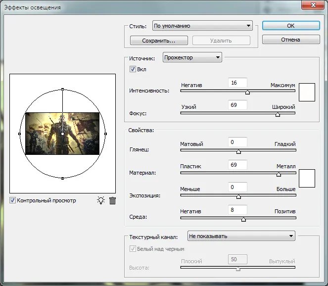
The filter has a ton of settings. With proper use, you can achieve stunning effects.
From Wallpaper to Calendar
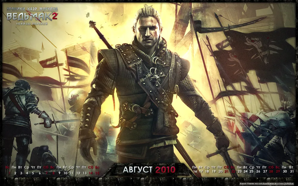
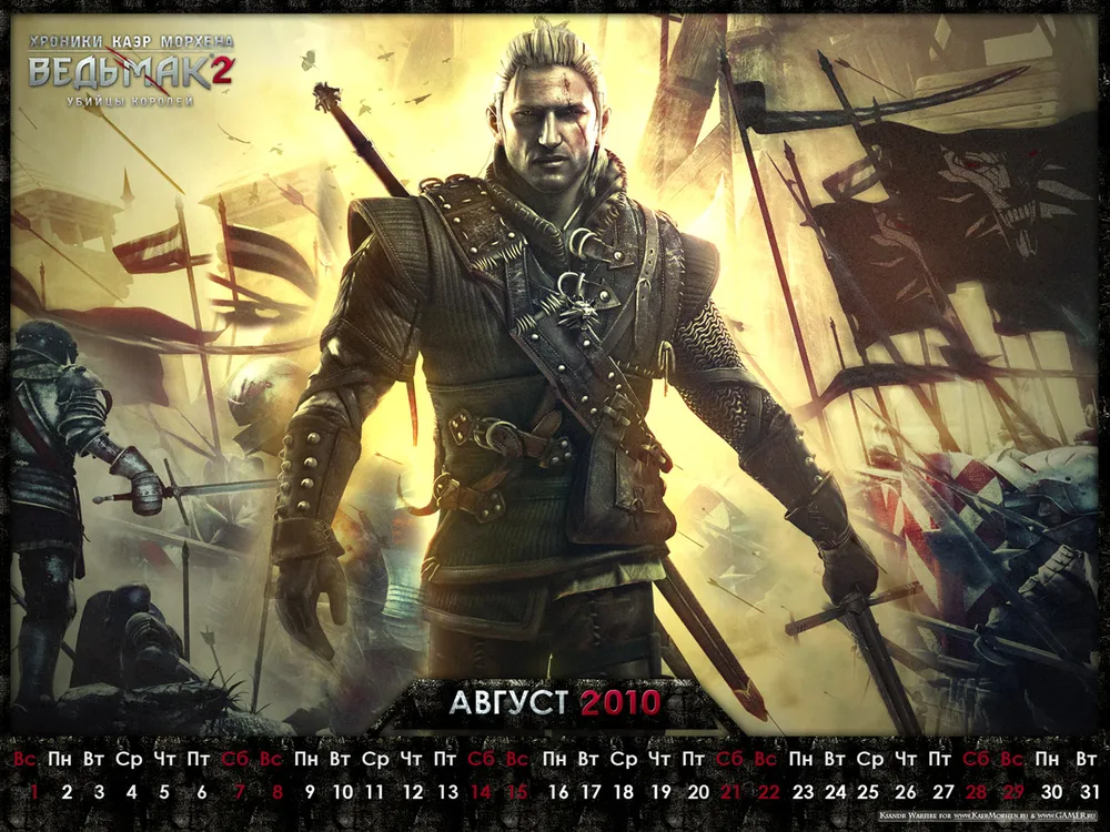
Once the work on the background is finished, you can start turning your wallpaper into a calendar. You can just add a calendar grid, or you can get creative with frames, underlays, different grid formats, and more. I wanted to place the grid at the bottom. Here it is important to remember that the calendar should be not only beautiful but also functional. This means the grid should not be right up against the bottom edge of the calendar, otherwise part of it will be covered by the taskbar. It is also not recommended to place it tightly against the left edge. In 99% of cases, there are shortcuts for users, which will cover your calendar grid. Other than that, there is freedom of creativity. I came up with a frame in free flight, not forgetting to include the name of the month and the year of the calendar within it. I advise you to do the same.
And the final stage, since you worked so hard, you have every right to include your copyrights, which I did. It is considered good form to place them so that they are not visible on the desktop, i.e. to position them in the area that will be hidden by the taskbar.
In the end, the creative part of the work was completed. The most unpleasant but necessary part remained.
Adapting to Different Resolutions
Ideally, at this stage, your source image should have a resolution of 1920x1200. And now we start to suffer. Using the two tools "Canvas Size" and "Image Size", we start making different resolution versions. The difference between them is that canvas size only changes the visible part of your canvas without affecting the image, while image size changes the canvas and the image sizes. This is convenient when you need to create a 1600x1200 version from your source. I would simply narrow the width to 1600 without changing the aspect ratio of the image. Yes, part of the image would be lost, but there’s nothing you can do about it. But since I forgot about the height, I had to increase it by extending the lower edge of the frame. Yes, that can be a cheat ;) Fortunately, the resolutions of 1600x1200, 1280x960, and 1024x768 have the same proportions. The same goes for 1680x1050 and 1440x900. So from now on, you can just shrink the image proportionally. Just in case, I separately save the sources under different names in all resolutions. Sometimes you make mistakes in one of them, and then have to redo it from scratch. So don’t be lazy - it will come in handy.
That's it, the work is done. At this stage, you can start to be proud of yourself, create a post on GAMER.ru, and boast about your heroics.
Bonus
Version without the calendar grid in the resolution of 1920x1080. Just don’t ask for other resolutions; start mastering Photoshop by resizing this image for yourself.
Super Bonus
The gifts don't end here. As an experiment, I am posting the source of my calendar. I hope that everyone who downloads it will do so only to enhance their Photoshop skills and not to tweak two details and post their "own wallpaper" on the internet. Respect the creativity of CD Projekt RED artists and my modest design work, folks, so that this time doesn’t become the last.
• **Download the source** (29Mb)
Instead of a Postscript
As usual, I look forward to your comments, remarks, and suggestions. They are much more important than silent likes, although I won’t refuse those either :)
The author of the calendar and text is me, Ksandr\_Warfire
Material prepared specifically for KaerMorhen.ru and GAMER.ru